The study of color theory is essential for graphic designers, artists, interior decorators, and marketers to create compelling designs that evoke the desired response from their target audience.

Color is an integral part of our visual world, and its impact on our daily lives cannot be underestimated.
Let's explore the sixth most important aspects of color theory that designers and marketers need to consider in their work.
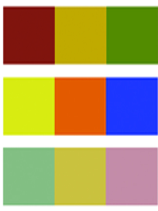
The first aspect of color theory is hue. Hue refers to the pure color that we see, such as red, blue, or green. The hues are positioned on the color wheel, which is a circular diagram that arranges the colors in a specific order. The color wheel has primary, secondary, and tertiary colors, and each hue has unique properties that contribute to the overall design.
The second aspect of color theory is saturation. Saturation refers to the intensity of the color, ranging from full intensity to desaturated or muted tones. Saturation can have a profound impact on our mood and emotions. High saturation colors tend to be more energetic and dynamic, while desaturated colors create a more calming and serene atmosphere.
The third aspect of color theory is value. Value refers to the lightness or darkness of the color, and it can be adjusted by adding white or black to a hue. Value is critical for creating contrast in a design and can create depth or emphasize certain elements.
The fourth aspect of color theory is complementary colors. Complementary colors are the opposite colors on the color wheel; for example, red and green, blue and orange, purple and yellow. Complementary colors create a strong visual impact when used together and can be used to create contrast, emphasize certain elements, or create a vibrant and dynamic design.
The fifth aspect of color theory is analogous colors. Analogous colors are adjacent colors on the color wheel, such as red-orange, orange, and yellow-orange. Analogous colors create a harmonious and cohesive color scheme and can be used to create a subtle and sophisticated design.
The sixth aspect of color theory is the cultural and psychological implications of color. Colors have different meanings and associations in different cultures, and designers need to be aware of these cultural nuances when creating designs for a global audience. Colors also have psychological implications, and different colors can evoke different emotions and moods in people. For example, red is associated with passion and energy, while blue is associated with calmness and serenity.
Color theory is a complex and multifaceted study that plays a vital role in creating effective designs that evoke the desired response from the audience. The six aspects of color theory highlighted here, hue, saturation, value, complementary colors, analogous colors, and cultural and psychological implications, all contribute to the overall success of a design. By understanding and applying these color theory concepts, designers and marketers can create compelling visual experiences that resonate with their audience.
Daylight (white light) is made up of numerous waves or impulses each having different dimensions or wavelengths. When separated, any single wavelength will produce a specific color impression to the human eye. What we actually see as color is known as its color effect. When an object is hit (bombarded) with light rays, the object absorbs certain waves and reflects others, this determines the color effect.
Observing Color
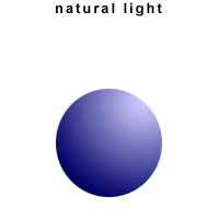
For example, what we actually see when we observe a blue ball is that the ball appears blue because it reflects only blue light and absorbs all other light.
The ball does not have color in itself. The light generates the color. What we see as color is the reflection of specific wavelength of light rays off an object.
The color white:
If all light waves are reflected from a surface the surface will appear to be white.
The color black:
Similarly, when all light waves are absorbed by a surface the surface will appear to be black.
The energy of light waves is converted into heat when absorbed. Wearing white or light colored clothing during hot summer days takes advantage of the quality.
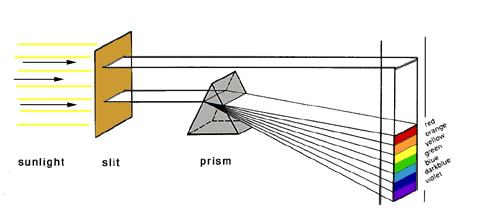
The color prism
The colored light in the visible spectrum ranges from red to violet. We can see this process by passing sunlight (white light) through a prism. Upon entering the prism, white light refracts (is bent, causing light waves of different lengths to be revealed, red having the longest wave length and violet having the shortest) into the visible spectrum.
Similarly, white light can be generated when all colored light in the spectrum is passed through a converging lens.
These color tones have all been created using glazes. They are hand mixed using Universal tinters, artist acrylic paint or artist oil paint blended with Glazing liquid and applied over a specific base color. Each recipe includes exact base-color specs, color mixing ratios and guides on glazing techniques. Simply choose the color you want, or learn the basic color combinations and create your own custom colors.
Note: due to the hand mixed - custom nature of each glaze recipe, your results may differ slightly.
Color Palette

From selecting Historic or Period colors to mixing original colors for glazing and decorative effects, the artSparx Color Palette is here to help. You'll find color mixing recipes, ideas and basic color principles to help get you started.
ColorSelect System

The artSparx colorSelect System provides detailed instructions and step-by-step tutorials for creating custom color effects in your home or office. For artSparxPro members. You'll learn how to: Use the correct base colors: Creating a glaze: The Colorant: The Mixing Ratio: Mixing the glaze The basic glazing process Getting Ready Testing your glaze mixture Quick Chart: Proper use of colorants
ColorScheme System

Understanding the 12 step color wheel Creating a 12 step color wheel. Basic principles of color Primary, secondary and tertiary colors Tints and shades, value and hue, neutral grays Creating harmonious color schemes Using complementary and contrasting colors Using triadic colors to create balanced color schemes Using tetrads to create balanced color schemes
Color Theory

About Color How we see color Learning to use color Advanced color principles For those interested in in-depth color learning. Ideal for designers, artists, illustrators and graphic designers.
Inspired by the ornate plaster-work of Renaissance Italy, decorative plaster has a millennial history, with origins dating back to the Rome of the Caesars and in the art of Ancient Greece.
It was Andrea Palladio, a famous Italian architect, who in the XVI century re-discovered it through his studies and re-proposed it in the splendid Venetian villas that are still to this day the distinguishing mark of his career. Stucco Veneziano is an aesthetic solution that step by step, conquered Venice and Lombardy, then Italy, and finally entire Europe in the XVII century. Today, venetian plaster Stucco Veneziano restores the splendor of a classic and prestigious finish.
Colonial Amercians drew inspriation from their European heritage. Curent design styles would filter across the ocean and become reinventedin early America. Proportion and scale took reign over ornementation, A neutral color palette of grey blue, greens and rose pinks is readily apparent.
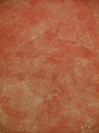
Stucco Rustico is a Traditional interior and exterior textured plaster that epitomizes the rustic old world charm commonly associated with Tuscan environments. I love this treatment for its ease of application and the natural, organic glazed appearance that results when using mineral based plasters and glazes. Whether a rough application or a smooth finish, this treatment holds true to the test of time and, in fact, feels as if time itself stopped to wash the walls personally.
The Rustic Style color palette falls within a distinct range of color tones and is essential in creating a successful Rustic interior. By using the appropriate color tones you can create a variety of design styles ranging from Period and Historic, regional or thematic. Color helps define our experiences within an interior and exterior environment. It affects us on a physical, emotional, and spiritual level and can be calming and passive, expressive and vital.
Floral patterns used as accents in fabrics and furniture are common place details in the English Country home. These graceful and organic patterns complement the cozy interior of this style and work particularly well with lace window treatments, an heirloom tea service set and the natural and rustic charm of wooden ceiling beams and slightly irregularly textured walls.