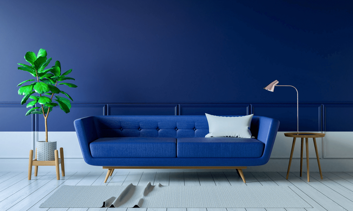
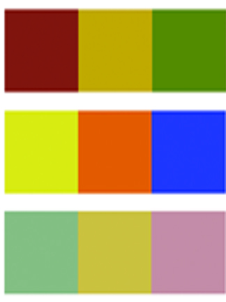
A monochromatic color scheme consists of different shades, tints, and tones of a single color, without including any other hues or colors.
Monochromatic color schemes are often used in design and art to create a harmonious and cohesive visual effect. By using different values (lightness or darkness), saturations (intensity or purity), and tones (grayscale versions) of a single color, a monochromatic color scheme can create a sense of unity and simplicity in a design.
One of the benefits of using a monochromatic color scheme is that it can create a subtle and sophisticated look, as the colors used are closely related and visually cohesive. Monochromatic color schemes are also versatile and can be used in various design styles, from minimalistic and modern to traditional and classic.
However, it's important to note that monochromatic color schemes can also be perceived as monotonous or lacking in visual interest if not executed properly. It's important to consider contrast, balance, and other design principles to create an engaging and visually appealing monochromatic color scheme.
Examples of monochromatic color schemes can include different shades of blue, various tones of gray, or multiple tints of green, where all colors are derived from a single hue or color by adjusting its value, saturation, or tone.


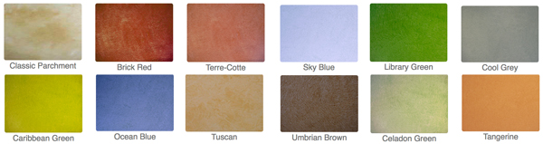
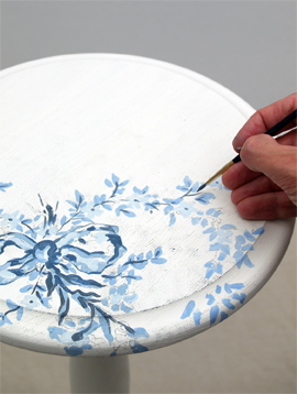
Getting going with these premixed glazes. Select one of our pre-mixed glaze colors or create your own. We custom mix any color from all major paint manufacturers. Just pick your own color from any swatch book and let us know the paint name and number and we'll send you the right glaze - interior or exterior - custom matched to your liking.
Create classic effects such as colorwashing, dragging, striee, antiquing effects, furniture effects and much more!
TIPS
Look for neutrals. Understanding a few simple color principles can result in successful color combinations for any project. Useful for interior design projects, decorative painting techniques, fine art painting, graphic design or illustration techniques, understanding color combinations can be easy and fun.
Look for compliments. When any one primary color is mixed with another a secondary color effect is produced. 3 secondary colors are produced from the mixing of one primary color with another. These colors are orange-green-violet. These secondary colors are also known as Secondary colors.
Working with Neutrals
Neutral colors primarily consist of a selection grays, beiges, tans, creams and taupe. These colors generally work with most other colors making them excellent choices as background colors for walls and ceilings. In this manner, more vibrant color choices can be executed in the interior in the form of fabrics, draperies and curtains, rugs and carpets, objects, furniture and accessories like throw-pillows, lamp shades and pictures or paintings.
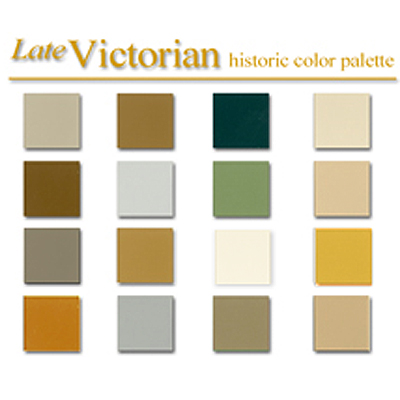
Colonial Amercians drew inspriation from their European heritage. Curent design styles would filter across the ocean and become reinventedin early America. Proportion and scale took reign over ornementation, A neutral color palette of grey blue, greens and rose pinks is readily apparent.
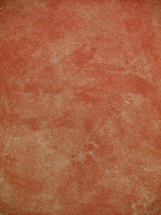
Stucco Rustico is a Traditional interior and exterior textured plaster that epitomizes the rustic old world charm commonly associated with Tuscan environments. I love this treatment for its ease of application and the natural, organic glazed appearance that results when using mineral based plasters and glazes. Whether a rough application or a smooth finish, this treatment holds true to the test of time and, in fact, feels as if time itself stopped to wash the walls personally.
The Rustic Style color palette falls within a distinct range of color tones and is essential in creating a successful Rustic interior. By using the appropriate color tones you can create a variety of design styles ranging from Period and Historic, regional or thematic. Color helps define our experiences within an interior and exterior environment. It affects us on a physical, emotional, and spiritual level and can be calming and passive, expressive and vital.
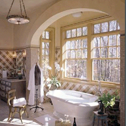
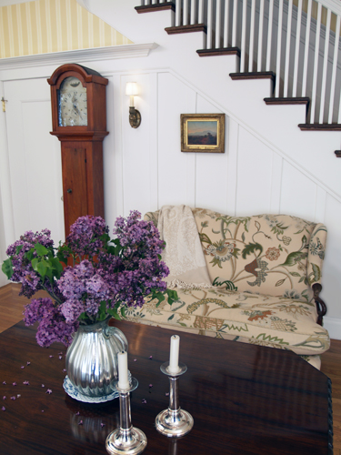
Floral patterns used as accents in fabrics and furniture are common place details in the English Country home. These graceful and organic patterns complement the cozy interior of this style and work particularly well with lace window treatments, an heirloom tea service set and the natural and rustic charm of wooden ceiling beams and slightly irregularly textured walls.