Statement Color Schemes
Add Personality with Bold Design Choices
If you want to make a strong impact in your space and express your unique style, incorporating a statement color scheme is a powerful design technique. A statement color is typically a bold, vibrant hue used strategically to create a focal point in the room. Whether it’s a single wall painted in a striking color, a brightly colored piece of furniture, or a vivid artwork, statement colors bring personality and energy to a space.
What is a Statement Color Scheme?
A statement color scheme revolves around the use of one dominant, eye-catching color in a room that contrasts with the overall color palette. This color is used sparingly but purposefully to draw attention and create a focal point. While the rest of the room may feature neutral or muted tones, the statement color injects a burst of energy, helping to highlight specific areas or pieces of decor.
This approach allows for creative flexibility—you can keep the overall room design simple and balanced while using the statement color to add visual excitement and personality without overwhelming the space.
Ways to Use Statement Colors
There are several ways to introduce a statement color into your room design, whether through paint, furniture, or accessories. Here are some effective methods to consider:
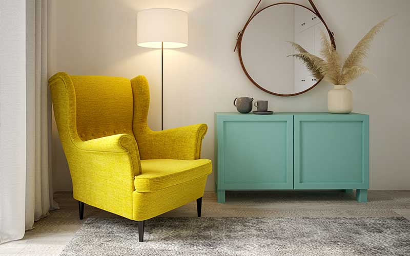
- Accent Walls: One of the most popular ways to use a statement color is by painting an accent wall in a bold hue. This technique works well in rooms where you want to create a visual anchor or emphasize a particular area, such as behind a bed, sofa, or fireplace. An accent wall with a strong color like deep blue, rich green, or fiery red can transform the entire look of the room.
- Statement Furniture: Incorporating a bold-colored piece of furniture is another great way to add a statement color. Whether it’s a brightly upholstered armchair, a vibrant sofa, or a uniquely painted coffee table, this approach adds both functionality and visual interest. Statement furniture pieces stand out and create a focal point that immediately grabs attention.
- Rugs and Textiles: A colorful rug or throw can instantly bring a statement color into a room without the need for permanent changes like painting. A bold, patterned rug in a living room or bedroom can set the tone for the rest of the decor, adding warmth, texture, and a pop of color that enhances the space.
- Artwork and Decor: Art is a fantastic way to introduce statement colors into your space. A large painting or an array of smaller artworks with bold colors can become the centerpiece of a room. Sculptures, vases, and decorative objects in vivid hues can also serve as striking accent pieces that add personality and artistic flair to the design.
The Benefits of Statement Color Schemes
Using statement colors in your design offers several benefits, particularly for those looking to create an impactful and personalized space. Here are some of the key advantages:
- Creates a Focal Point: A statement color naturally draws attention and creates a visual focal point in the room. This helps anchor the design and guides the viewer’s eye to the most important or interesting aspects of the space.
- Adds Personality and Style: A bold color choice is an excellent way to reflect your personality and unique style. Whether you opt for a daring, energetic color or a more sophisticated, moody hue, a statement color allows you to express your creativity.
- Enhances Neutral or Minimalist Designs: In rooms where neutral tones or minimalist designs dominate, a statement color adds excitement and contrast. It brings life to the space without compromising its simplicity or elegance.
- Flexibility and Versatility: The beauty of a statement color scheme is its versatility. You can change the statement color by simply swapping out accessories like cushions, rugs, or artwork, allowing you to update your space seasonally or as your tastes evolve.
Tips for Using Statement Colors Effectively
While statement colors can transform a space, it’s essential to use them thoughtfully to avoid overwhelming the room. Here are some tips for effectively incorporating statement colors:
- Start Small: If you’re new to bold colors, start with smaller items like cushions, vases, or art before committing to larger pieces like furniture or accent walls.
- Use Complementary Neutrals: To keep the design balanced, pair your statement color with neutral tones like white, gray, or beige. This allows the bold color to stand out without dominating the space.
- Stick to One Statement Color: Using too many bold colors in one room can create visual chaos. Stick to one statement color and complement it with subtle accents or neutral tones for a cohesive look.
- Consider Lighting: Lighting can affect how a color looks in a room. Before finalizing your statement color, test it in different lighting conditions to ensure it creates the desired effect.
Incorporating a statement color scheme into your design is a fantastic way to bring energy, personality, and focus to any room. Whether you choose a bold accent wall, a vibrant piece of furniture, or colorful accessories, statement colors add visual interest and help define your style. With careful planning and thoughtful use of bold hues, you can create a space that feels both dynamic and uniquely yours.


Selecting Colors
How to choose, what choose?
Mixing with color
Color is DESIGN. Create it, Own it!

Pre-mixed Glazes
Ready, set, GO!
Getting going with these premixed glazes. Select one of our pre-mixed glaze colors or create your own. We custom mix any color from all major paint manufacturers. Just pick your own color from any swatch book and let us know the paint name and number and we'll send you the right glaze - interior or exterior - custom matched to your liking.
Create classic effects such as colorwashing, dragging, striee, antiquing effects, furniture effects and much more!
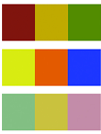
Color Palette
TIPS
Look for neutrals. Understanding a few simple color principles can result in successful color combinations for any project. Useful for interior design projects, decorative painting techniques, fine art painting, graphic design or illustration techniques, understanding color combinations can be easy and fun.
Look for compliments. When any one primary color is mixed with another a secondary color effect is produced. 3 secondary colors are produced from the mixing of one primary color with another. These colors are orange-green-violet. These secondary colors are also known as Secondary colors.
Working with Neutrals
Neutral colors primarily consist of a selection grays, beiges, tans, creams and taupe. These colors generally work with most other colors making them excellent choices as background colors for walls and ceilings. In this manner, more vibrant color choices can be executed in the interior in the form of fabrics, draperies and curtains, rugs and carpets, objects, furniture and accessories like throw-pillows, lamp shades and pictures or paintings.
What's Hot
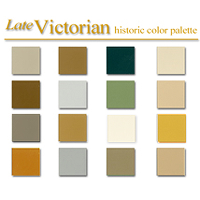
Early American Style
Colonial Amercians drew inspriation from their European heritage. Curent design styles would filter across the ocean and become reinventedin early America. Proportion and scale took reign over ornementation, A neutral color palette of grey blue, greens and rose pinks is readily apparent.
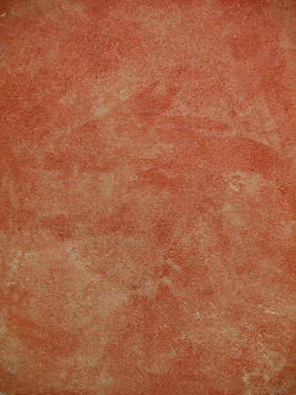
Stucco Rustico - Aged Plaster
Stucco Rustico is a Traditional interior and exterior textured plaster that epitomizes the rustic old world charm commonly associated with Tuscan environments. I love this treatment for its ease of application and the natural, organic glazed appearance that results when using mineral based plasters and glazes. Whether a rough application or a smooth finish, this treatment holds true to the test of time and, in fact, feels as if time itself stopped to wash the walls personally.
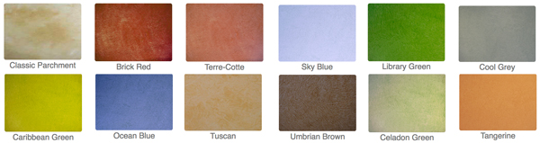
The Rustic Color Palette
The Rustic Style color palette falls within a distinct range of color tones and is essential in creating a successful Rustic interior. By using the appropriate color tones you can create a variety of design styles ranging from Period and Historic, regional or thematic. Color helps define our experiences within an interior and exterior environment. It affects us on a physical, emotional, and spiritual level and can be calming and passive, expressive and vital.
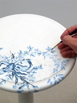
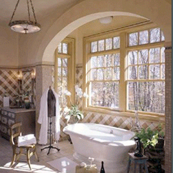
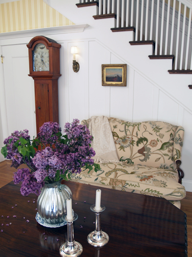
Painted Floral Details
Floral patterns used as accents in fabrics and furniture are common place details in the English Country home. These graceful and organic patterns complement the cozy interior of this style and work particularly well with lace window treatments, an heirloom tea service set and the natural and rustic charm of wooden ceiling beams and slightly irregularly textured walls.