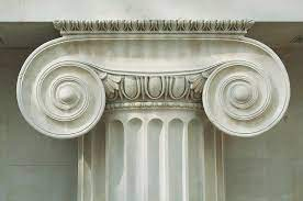
Scale and Proportion - balancing Space and Art
Exploring Scale and Proportion in Interior Design and Decorative Art
Achieving Visual Harmony through Proper Sizing and Relationships in Design and Artistic Expressions
Scale and proportion are important elements in both interior design and decorative art applications. While they share some similarities, there are also distinct differences in how these concepts are applied in each context.
Scale and Proportion in Interior Design
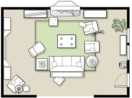
Scale refers to the relative size of objects and elements within a space. It involves considering the size of furniture, architectural features, and other elements in relation to the overall dimensions of the room.
Proportion focuses on the visual balance and harmonious relationship between different elements—how pieces relate to one another and to the room as a whole.
In interior design, achieving the right scale and proportion is crucial for creating a balanced and visually pleasing space. For example, in a living room, selecting a sofa that is proportionate to the room size and other furniture pieces is important to ensure a harmonious arrangement. Likewise, choosing a dining table that is in scale with the dining area and chairs is essential for creating a visually balanced setting.
Scale and Proportion in Decorative Arts
In decorative art applications, scale and proportion play a similar role but with some variations.
Scale refers to the size of the artwork or decorative object itself—its dimensions relative to the wall, surface, or space where it will live.
Proportion in decorative art pertains to the internal relationships inside the artwork: the balance of shapes, motifs, figures, negative space, and visual weight.
In decorative art, achieving the right scale and proportion is critical for visual impact and aesthetic appeal. For instance, when hanging a large painting on a wall, it should be proportionate to the wall size, ensuring it doesn't overwhelm or get lost within the space. Similarly, within the artwork, the sizes of different elements such as figures, objects, or patterns need to be proportionate to one another to create visual harmony.
In both interior design and decorative art, scale and proportion are essential for creating a sense of balance, harmony, and visual cohesion.
While interior design focuses on the relationship between objects within a space, decorative art applications emphasize the sizing and arrangement of elements within an artwork or decorative composition. By considering scale and proportion in these respective contexts, designers and artists can create visually pleasing and well-balanced environments and artworks.
What is the "Golden Rule" and how is it used in design?
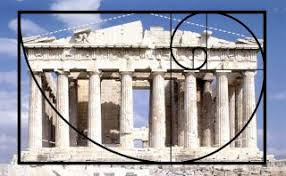
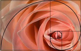
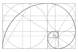
The "golden rule" for proportion in design is often referred to as the Golden Ratio or Divine Proportion.
It is a mathematical concept represented by the ratio of approximately 1.618:1. This ratio has been used for centuries in art, architecture, and design due to its perceived aesthetic appeal.
The Golden Ratio is believed to create a sense of visual harmony and balance. It is often applied by dividing a line or rectangle into two sections, with the ratio of the longer section to the shorter section being approximately 1.618. This ratio can be found in nature, such as in the spirals of seashells, the branching of trees, and even in human facial proportions.
In design, the Golden Ratio can be applied to determine the ideal proportions of various elements within a composition. It helps designers create visually pleasing layouts by establishing a balanced relationship between different design elements, such as the size and positioning of text blocks, images, or graphic elements.
While the Golden Ratio is a widely recognized principle of proportion, it's important to note that it is not a strict rule. Designers often use it as a guideline and adapt it to suit their specific needs and aesthetic preferences. Other proportional systems, such as the Rule of Thirds or grids based on different ratios, are also commonly used in design to achieve visual harmony and balance.
Essential interior design Elements
 Color Design
 Scale and Proportion
 Furniture and Layout
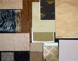
 Texture and Materials
 Lighting
 Patterns and Textiles
Explore your Style!
Historic design, thematic design, and geographic design are three different approaches in interior design that focus on different aspects of design inspiration and implementation.
Geographic Styles
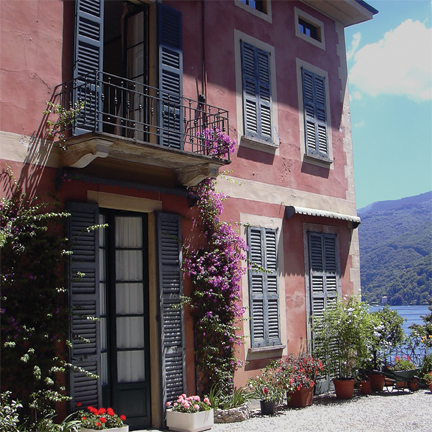 Tuscan
 New Orleans
 Caribbean
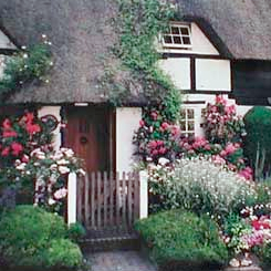 English Country
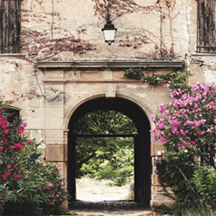 French Country
 Adirondack
Historic Styles
 Arts and Crafts
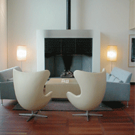 Modern
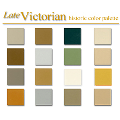
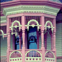 Victorian
 Georgian
 Federal
 Gothic
Thematic Styles
 Log Cabin
 Romantic
 Americana
 Flea Market
 Diner
Diner Japanese
Decorative Paint Effects
 Venetian Plaster
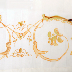 Painted Scrolls
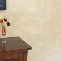 Classic Parchment
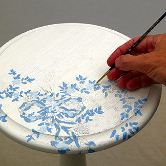 Painted Furniture
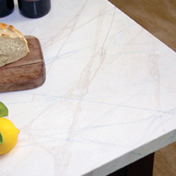 Marblizing
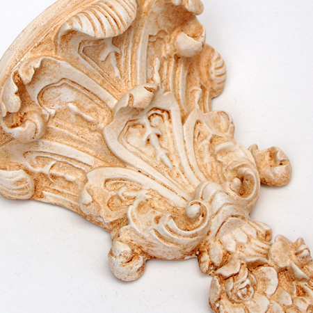 Antique Glaze
Hand Painted Floor Cloth
Freshen any room with this creative checker board painted floor cloth.
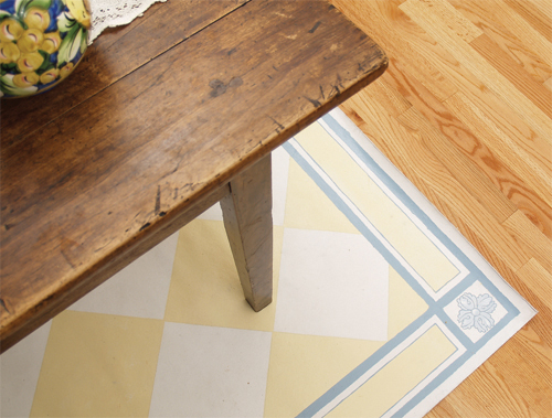
The magic of a painted floor cloth can transform a common space into a unique and beautiful expression of you and your family’s personality. Use these versatile cloths for entrance floors, children's rooms, porches, or just about anywhere. Due to the hand painted nature of each floor cloth there is a great opportunity to customize an interior detail to the home, adding quirky elements and personal touches that help create these singularly unique painted floor cloths.
Oil Gilding Video Tutorial
Quick Dry oil size gilding. This detailed demonstration shows you how to apply genuine gold, Silver, imitation gold, aluminum and copper leaf to objects and furniture using the classic 3 hour oil size method. Brought to you by the folks at gildedplanet.com, you'll learn about types of adhesive, testing for 'tack' and drying rates, easy leaf application tips and cleaning and burnishing the leaf.
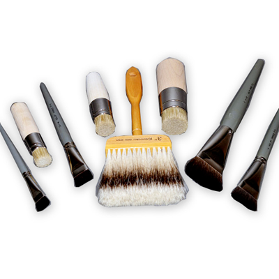
Artists Brushes
Finest quality natural hair brushes for the beginner to the pro.
What's your project? You may be working on canvas, or paper, or glass, or maybe clay? Our natural hair brushes include Sable, Badger, and a variety of Squirrel, Goat and Bristle options. You'll find great options for lettering and lining, flat mops for washing on color, or dusting gold leaf. Finely crafted in the US, Europe and Asia. Artist Quills - Lettering brushes - Fine Sable - Gesso Stippling - Flat Wash - Gilding Mops - Decorative Paint and Faux Brushes
Antique Glazes and Aged Finishes
Antique Glaze Create the perfect antique finish. Furniture, objects, paintings, wall and ceilings. Our exclusive line of custom antique glazes are idealy suited for interior and exterior applications. This acrylic based medium is eco-safe, easy application and clean up, with enhanced color saturation. Great for all weather conditions. Pre-mixed colors for historic application, thematic and geographic design styles.
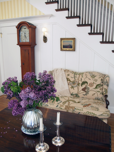
Early American Style
Colonial Amercians drew inspriation from their European heritage. Curent design styles would filter across the ocean and become reinventedin early America. Proportion and scale took reign over ornementation, A neutral color palette of grey blue, greens and rose pinks is readily apparent.
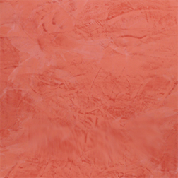
Stucco Rustico - Aged Plaster
Stucco Rustico is a Traditional interior and exterior textured plaster that epitomizes the rustic old world charm commonly associated with Tuscan environments. I love this treatment for its ease of application and the natural, organic glazed appearance that results when using mineral based plasters and glazes. Whether a rough application or a smooth finish, this treatment holds true to the test of time and, in fact, feels as if time itself stopped to wash the walls personally.
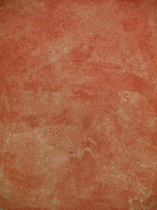
The Rustic Color Palette
The Rustic Style color palette falls within a distinct range of color tones and is essential in creating a successful Rustic interior. By using the appropriate color tones you can create a variety of design styles ranging from Period and Historic, regional or thematic. Color helps define our experiences within an interior and exterior environment. It affects us on a physical, emotional, and spiritual level and can be calming and passive, expressive and vital.
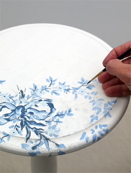
Painted Floral Details
Floral patterns used as accents in fabrics and furniture are common place details in the English Country home. These graceful and organic patterns complement the cozy interior of this style and work particularly well with lace window treatments, an heirloom tea service set and the natural and rustic charm of wooden ceiling beams and slightly irregularly textured walls.